Tsum Tsum Stadium

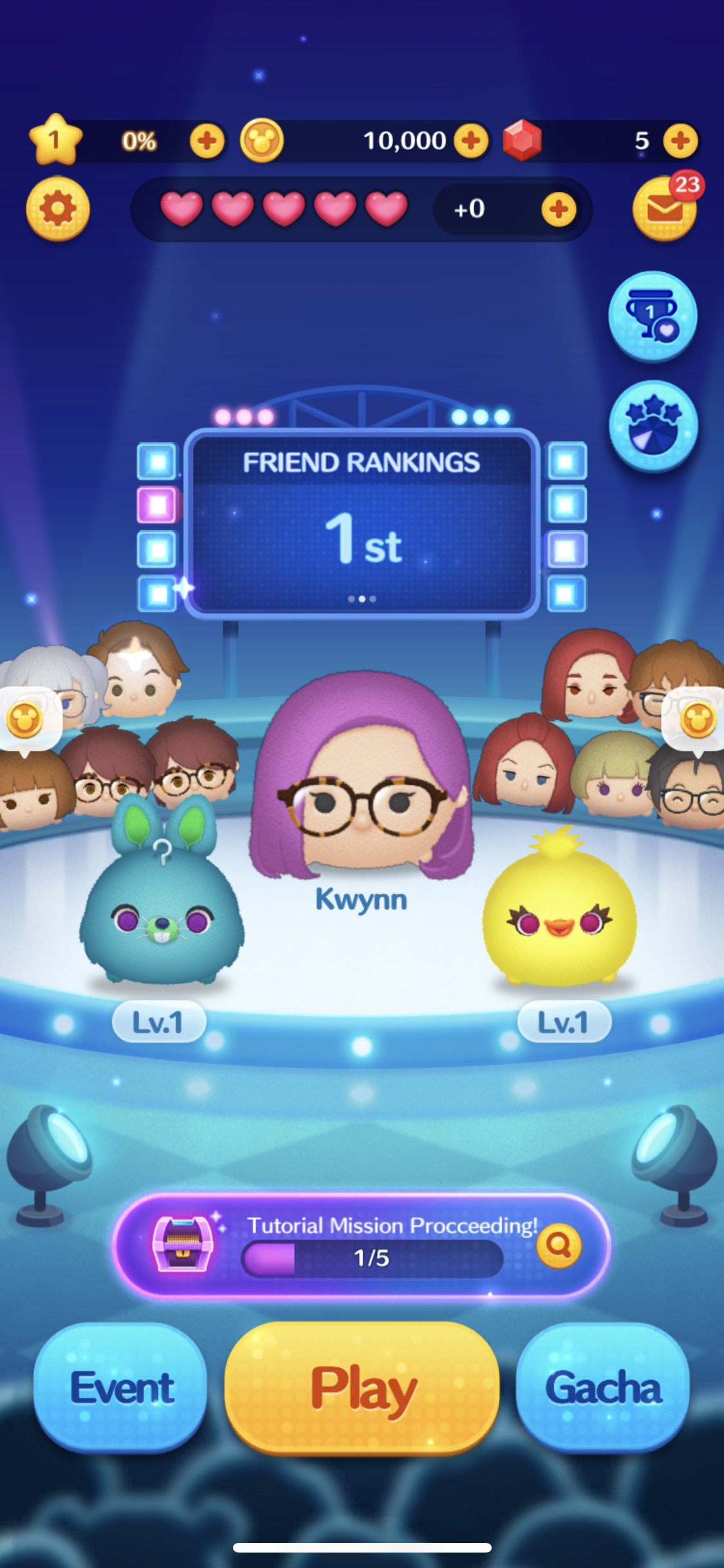
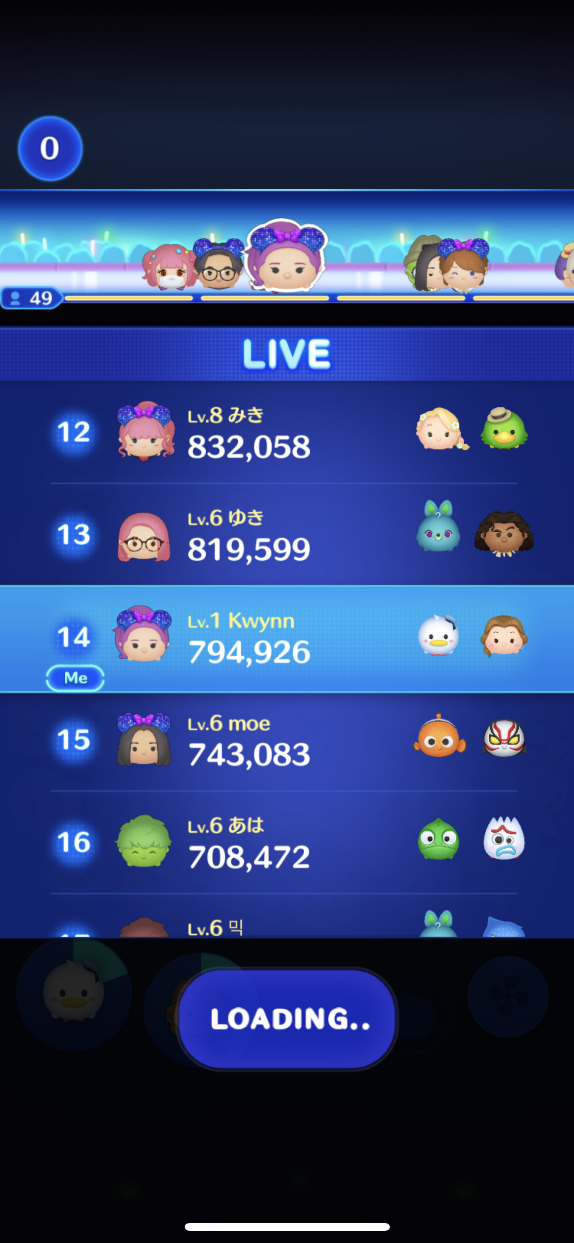
Like regular Tsum Tsum, but competing with 49 other players!


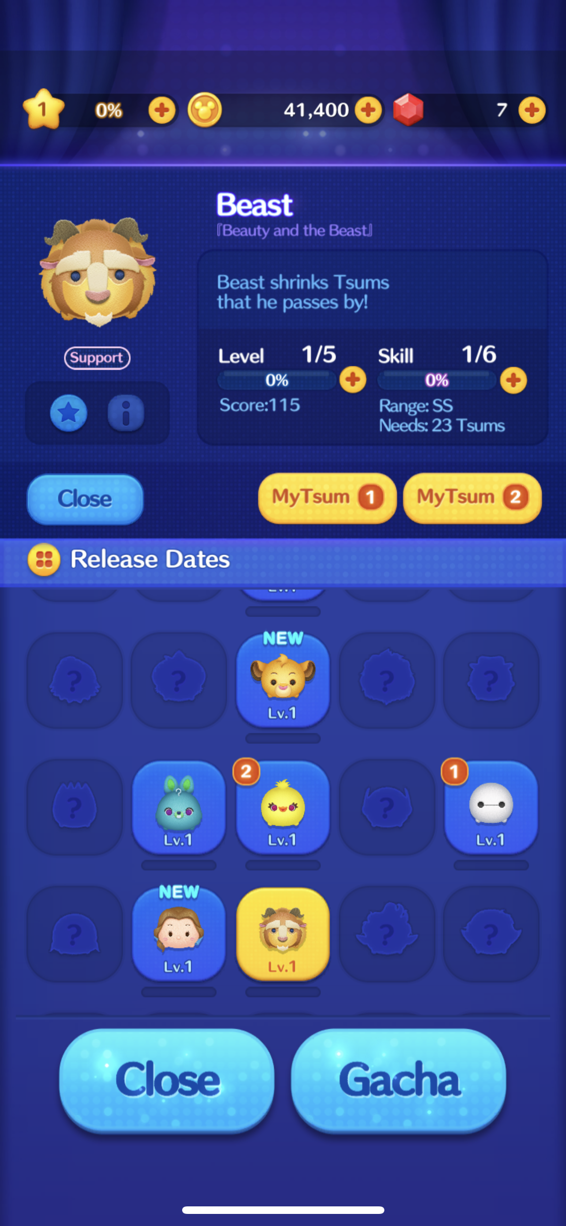
Plenty of new features with this game, it uses the same base mechanics as the original Tsum Tsum game, but this time adding a competitive edge. Innovative incorporation of Battle Royal without the need to hurt anyone else. 50 players are gathered for each round, players are then ranked by overall score at the end of a fixed time. Players can now use 2 Tsums instead of 1, and everyone has their own customizable avatar, how cool is that!

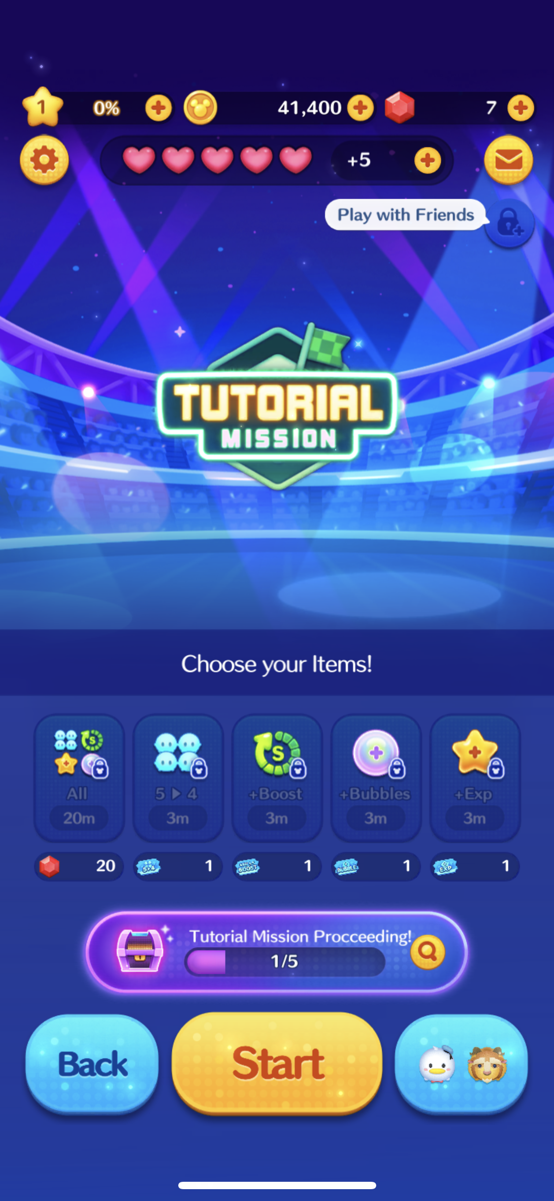
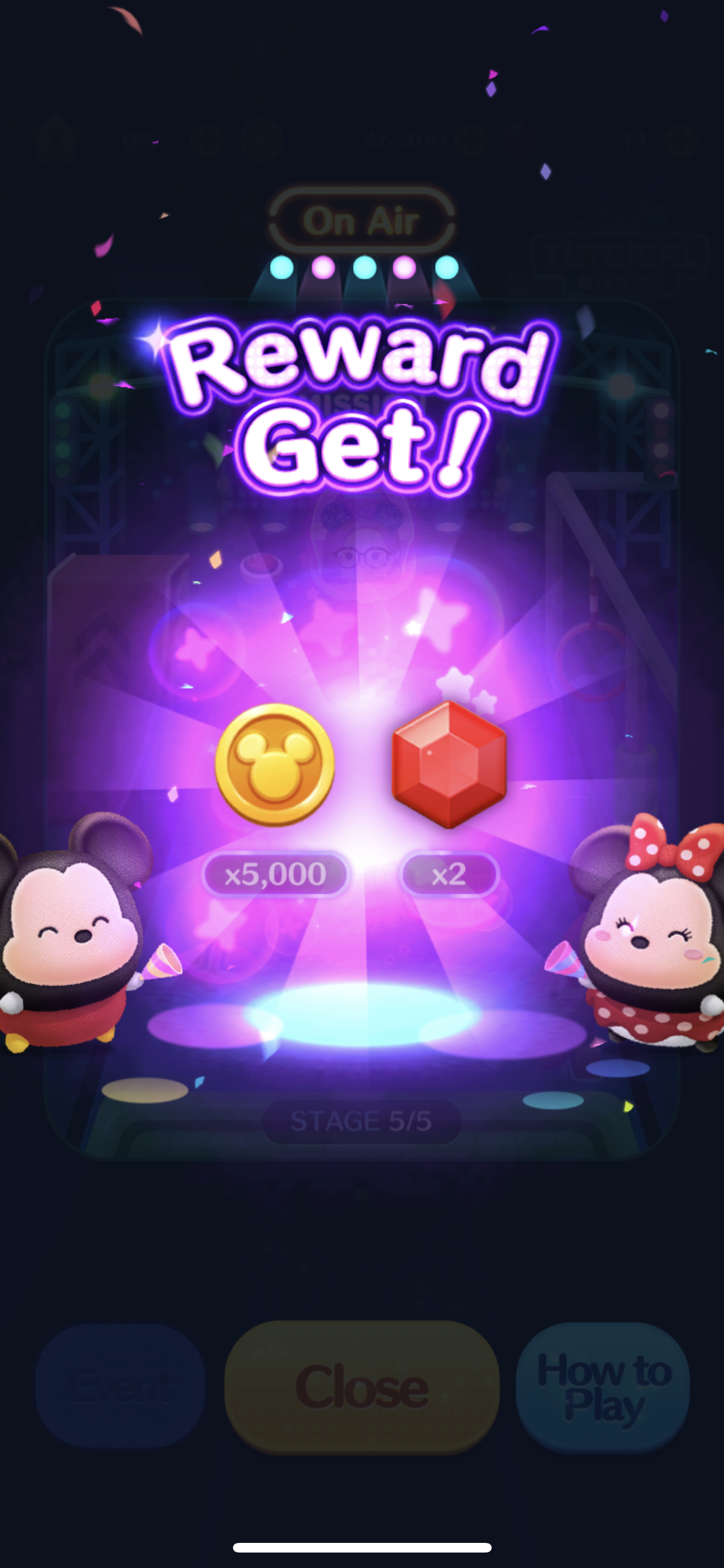
Art style represents a performance in a stadium, with lots of colorful bright lights with heavy use of blue. Shapes are rounded, with a little pop up effect, resembling the shape of the Tsums themselves. Information is displayed clearly, and every round feels very rewarding even if the player didn’t win.


Developer: LINE | Publisher: LINE | Platform: Mobile

第九所 (Ninth District?)

Going through the 60s trying to get to Mars


Interesting sandbox survival management game set in the early 60s when China was going through Cultural Revolution. The location is in a remote dessert with enough space for multiple factories and workers to build their way to Space. The game brings the player through the Cultural Revolution from the start with the Great Leap Forward (1958) focusing on industrialization. The player will then slowly go through the phases of revolution until ultimately they build a rocket. (I haven’t gotten that far yet.)

The game starts out with a book, therefore it makes sense to think of this as a diary, journaling the past, therefore the art style is worn and vintage looking. The details on every piece of paper are the most interesting part, all very simple and elegant. The art style suits the time period, whereby there was nothing too high tech, and everything was written in pen and paper. Big patches of color, NPCs have no faces, probably to represent Chinese culture of not standing out.


Developer: Netease | Publisher: Netease | Platform: iOS(China Only)

Rummikub

Digital version of Rummikub, still makes my brain hurt


Rummikub is easy to pick up, but difficult to master. This digital version of the board game is good for practicing solo, and also very fun especially during this period with social distancing. The tiles consists of 8 sets of 1 through 13 in 4 colors (if this makes sense). What I like about this version is how the game will stack and arrange tiles in a neat fashion for players, making the tiles easier to spot for manipulation. The tile holder automatically extends itself, and there is a sorting function too! Makes me not want to play the physical version anymore.

UI reminds me of classic casino games, with the royal blue background looking like a gambling table. Other than the tiles, the shapes used are rounded. Also, colors are barely used in the interface. Simple game, simple UI.


Developer: Kinkajoo Games | Publisher: Kinkajoo Games

Tour of Neverland

Kinda like Harvest Moon, but on the phone!


Cute little mobile game that got me hooked for a while until progression got really boring. Has all the mechanics one can think of when it comes to a country life game: farming, fishing, rearing animals, bug catching, mining, and of course making friends with NPCs. The most interesting mechanic would be the energy system, whereby there are 2 bars: 1 for expendable energy that you can use now, and stored energy which will convert into expendable energy every few minutes. In order to gain energy, the character has to eat, which fills up both bars depending on the type of food consumed. Players have the option to purchase a digestion potion which instantly turns stored energy into expendable energy. Other monetization aspects include dressing up your character with gear that can help boost daily activities, buying supplies / resources to upgrade the farm, food items that restore energy.

Art style is cartoon-ish, cute, using highly saturated and bright colors to bring out a cheerful, upbeat mood. Icons are colorful, and shapes are all round, giving a friendly, approachable feel to the interface. The panels are slightly more muted compared to the HUD, with brown and cream as the main colors. UX wise, functions are compartmentalized properly, information is clear, and use of icons are appropriate. Overall use of simple gradients, no textures.


Developer: 上海锐战网络科技有限公司 | Publisher: Mars Game (HongKong) Network Technology Co., Ltd.

Remnant: From The Ashes

Getting rid of the Root (of all evil) to save the world from their own subconscious.


Personally not a fan of soul-like games, but since it’s co-op multiplayer, I enjoyed the game even though it was a test of my endurance. Clearing maps and defeating bosses gave me a sense of accomplishment, especially after dying plenty of times. As the player collects gear and levels up, the game’s difficulty seems to scale accordingly.

Overall dark palette, with careful use of color to show importance of information. UI is grunge-y but neat, feedback is adequate, and never gets in the way. My guess is that the theme was probably chosen to represent the post-apocalyptic environment. Icons are very nicely rendered, highly detailed with good use of positive and negative space.


Developer: Gunfire Games | Publisher: Perfect World Entertainment | Engine: UE4

Marvel's Avengers

When superheroes are forced into hiding, and end up getting saved by Inhumans (mutants)


This game had mediocre reviews, but I decided to try my luck anyway since I really enjoyed the Ultimate Alliance series, and button mashing has always been my jam. It’s not a /bad/ game, but I’m not hooked on this grind-fest. There’s monetization aspects in the game, and the battle pass isn’t easy to complete.

Story is great though (so far), pacing is appropriate. I especially loved the tutorial! I could totally immerse myself, and relate to the character being at an awesome carnival event. The tutorial helps players to learn basic controls by playing carnival games, then getting rewarded, how great is that! Then bringing in a more serious tone and letting all the events unfold, while learning how to handle each superhero and their strengths. The controls are the same across the board for every superhero, but their differences shine through especially in multiplayer mode when they each have a different role to play. Level design is clever enough to bring out this aspect.

The UI looks great, befitting of a AAA title, but the UX can be frustrating sometimes, especially with the disappearing markers (objectives, places, NPC, etc). UI is very light and sharp, with use of clean lines and squares with cut corners as their main shape. There’s a sense of security from the dark blue, with a little streak of white that feels like a fluorescent lamp, feels like a reflection of an interior of the helicarrier.


Developers: Crystal Dynamics, Crystal Northwest, Nixxes Software BV, Eidos-Montreal | Publisher: Square Enix | Engine: In-house Engine