Remnant: From The Ashes

Getting rid of the Root (of all evil) to save the world from their own subconscious.


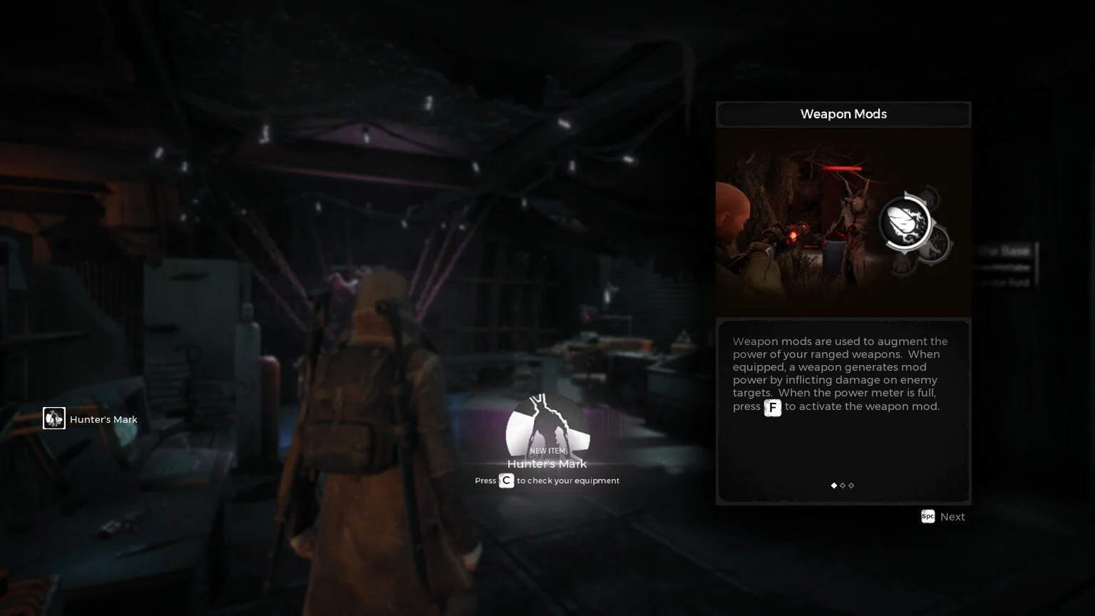
Personally not a fan of soul-like games, but since it’s co-op multiplayer, I enjoyed the game even though it was a test of my endurance. Clearing maps and defeating bosses gave me a sense of accomplishment, especially after dying plenty of times. As the player collects gear and levels up, the game’s difficulty seems to scale accordingly.

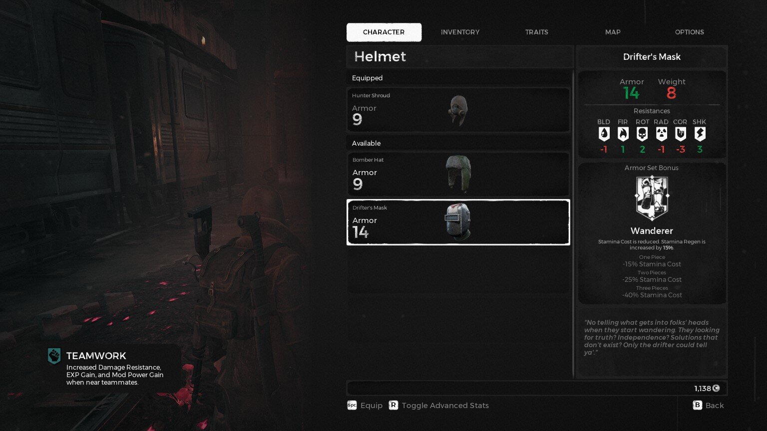
Overall dark palette, with careful use of color to show importance of information. UI is grunge-y but neat, feedback is adequate, and never gets in the way. My guess is that the theme was probably chosen to represent the post-apocalyptic environment. Icons are very nicely rendered, highly detailed with good use of positive and negative space.


Developer: Gunfire Games | Publisher: Perfect World Entertainment | Engine: UE4

Marvel's Avengers

When superheroes are forced into hiding, and end up getting saved by Inhumans (mutants)


This game had mediocre reviews, but I decided to try my luck anyway since I really enjoyed the Ultimate Alliance series, and button mashing has always been my jam. It’s not a /bad/ game, but I’m not hooked on this grind-fest. There’s monetization aspects in the game, and the battle pass isn’t easy to complete.

Story is great though (so far), pacing is appropriate. I especially loved the tutorial! I could totally immerse myself, and relate to the character being at an awesome carnival event. The tutorial helps players to learn basic controls by playing carnival games, then getting rewarded, how great is that! Then bringing in a more serious tone and letting all the events unfold, while learning how to handle each superhero and their strengths. The controls are the same across the board for every superhero, but their differences shine through especially in multiplayer mode when they each have a different role to play. Level design is clever enough to bring out this aspect.

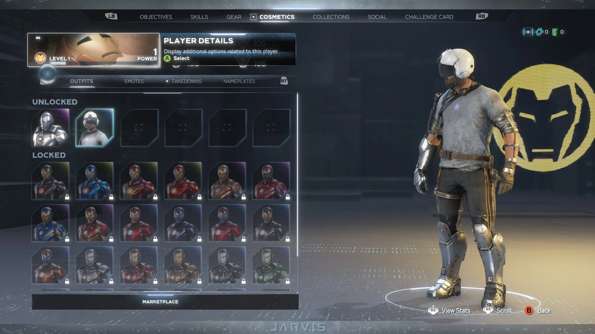
The UI looks great, befitting of a AAA title, but the UX can be frustrating sometimes, especially with the disappearing markers (objectives, places, NPC, etc). UI is very light and sharp, with use of clean lines and squares with cut corners as their main shape. There’s a sense of security from the dark blue, with a little streak of white that feels like a fluorescent lamp, feels like a reflection of an interior of the helicarrier.


Developers: Crystal Dynamics, Crystal Northwest, Nixxes Software BV, Eidos-Montreal | Publisher: Square Enix | Engine: In-house Engine 

Dead In Vinland

Keeping a shipwrecked Viking family alive on a mysterious island one day at a time.


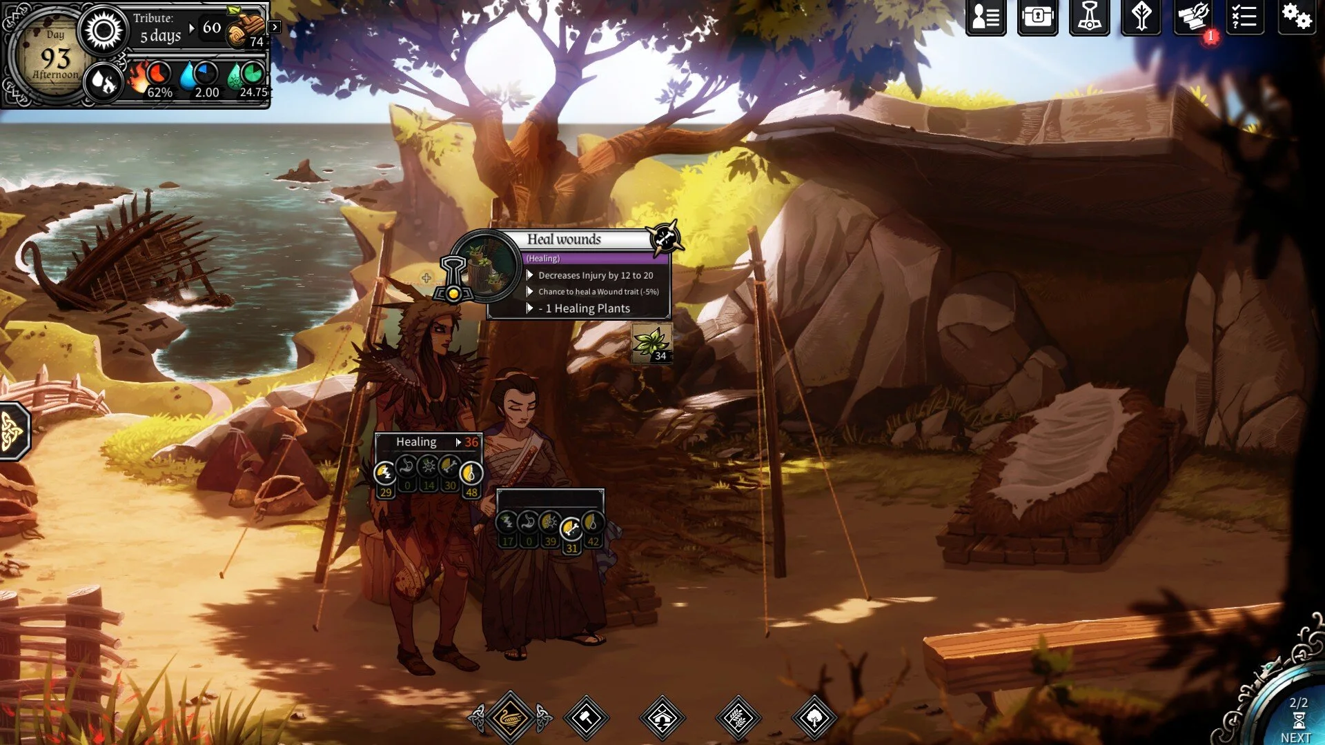
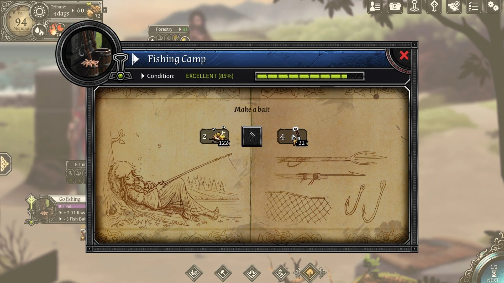
Players help the exiled and shipwrecked family to establish their base, collect / manage resources, explore the island and stay alive. Every now and then, there will be battle and it is turn based. Gameplay wise, controls are pretty simple, mostly clicking, dragging and dropping. The stats and traits of each character give this game depth by affecting their efficiency in camp, and in battle; akin to tabletop RPGs and dice rolls but the results are calculated for you.

The art drawn style does a good job of drawing people in, although all animations are mostly very simple. The layout definitely does a good job at presenting plenty of information to the player in a digestable, easy to understand format, and doesn’t feel overwhelming.


Developer: CCCP | Publishers: Dear Villagers, Plug In Digital, MP Digital LLC | Engine: Unity

A Way Out

Following the adventures of 2 people finding A Way Out


Completed the game 3 times with 3 different people now, game has limited replayability from varying story choices; all leading to the same ending.

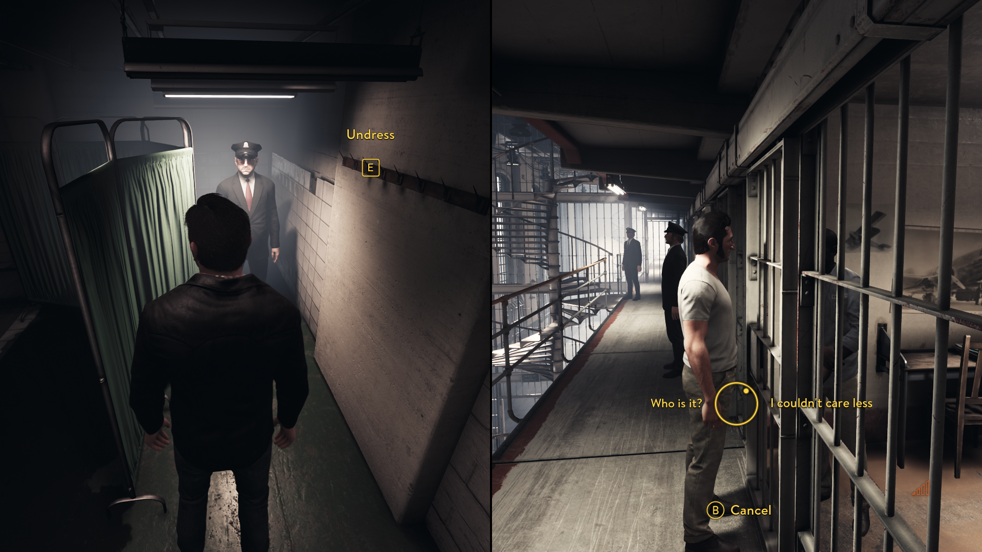
The game itself plays more like an interactive movie rather than a game, although it does have some gameplay resulting in the player being more invested, and excited when events happen. What makes this piece interesting is the split screen, co-dependent co-op experience, and cannot be played without another player. Both players must work together in order to get through obstacles, communication is essential.

UI is simple, bare minimal, and only appears when it is needed; works well for a linear story movie-like game. The UI consists of simple shapes, and only 1 main color, which is yellow. Although yellow itself is a bright color, the environment is nicely set up to not conflict with the UI, the UI is still nicely shows up on screen.


Developer: Hazelight | Publisher: EA | Engine: UE 4