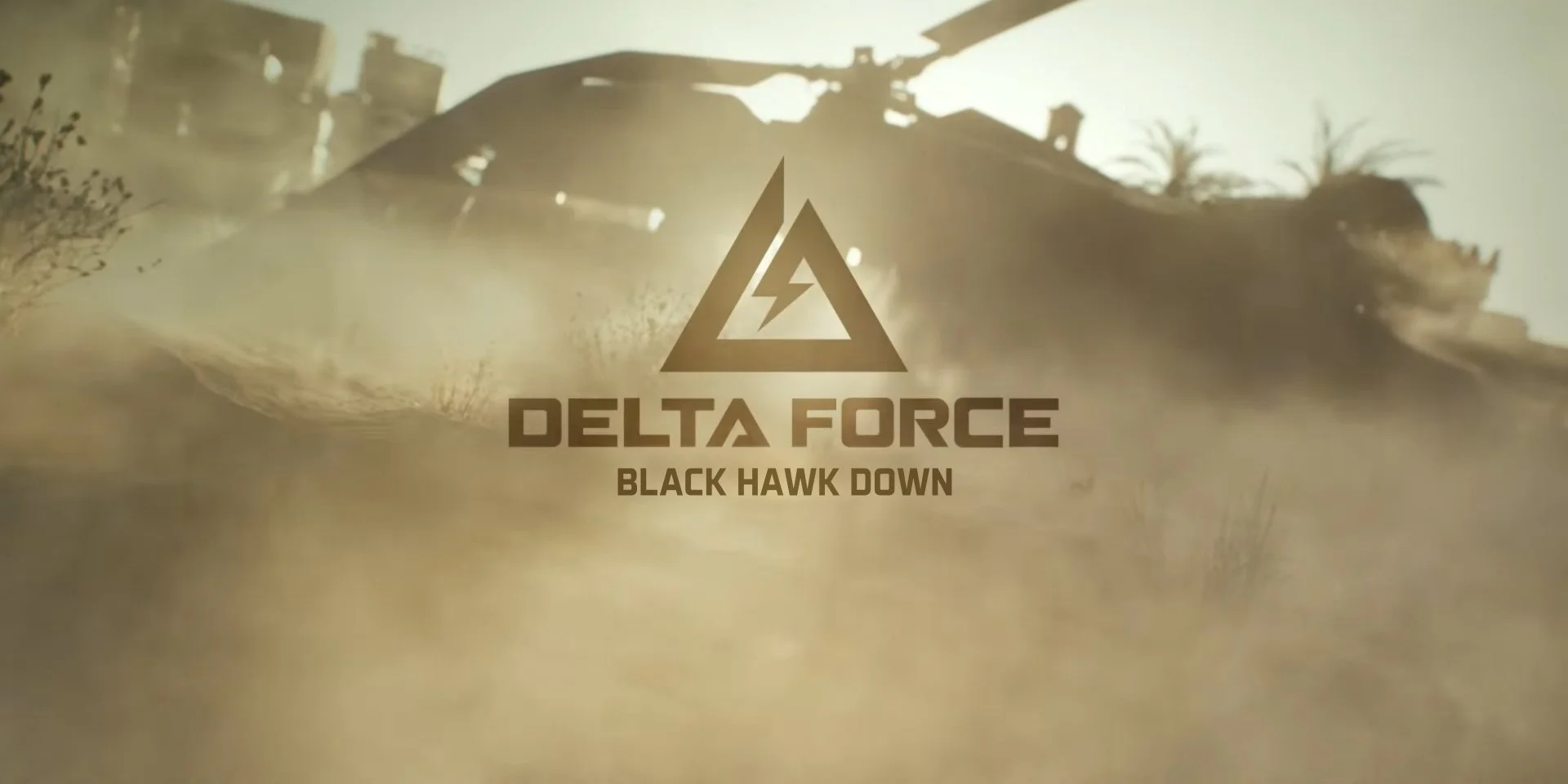
I was responsible for the UI of Black Hawk Down, where our primary goal was to create a unique game experience and visuals through thoughtful design choices that blended the elements of the main game and the traits of the DLC.
Overseeing the project from the beginning and building it over time bit by bit, there were definitely obstacles that we had to overcome.
We engaged in constant iteration driven by feedback, ensuring that each element of the UI was refined to meet the players' needs. This proactive approach involved a collaborative effort to identify challenges and implement effective solutions, ultimately leading to a polished interface that complemented the gameplay. Each cycle of feedback and refinement brought us closer to achieving the best version of the game, reflecting our commitment to quality and player engagement.
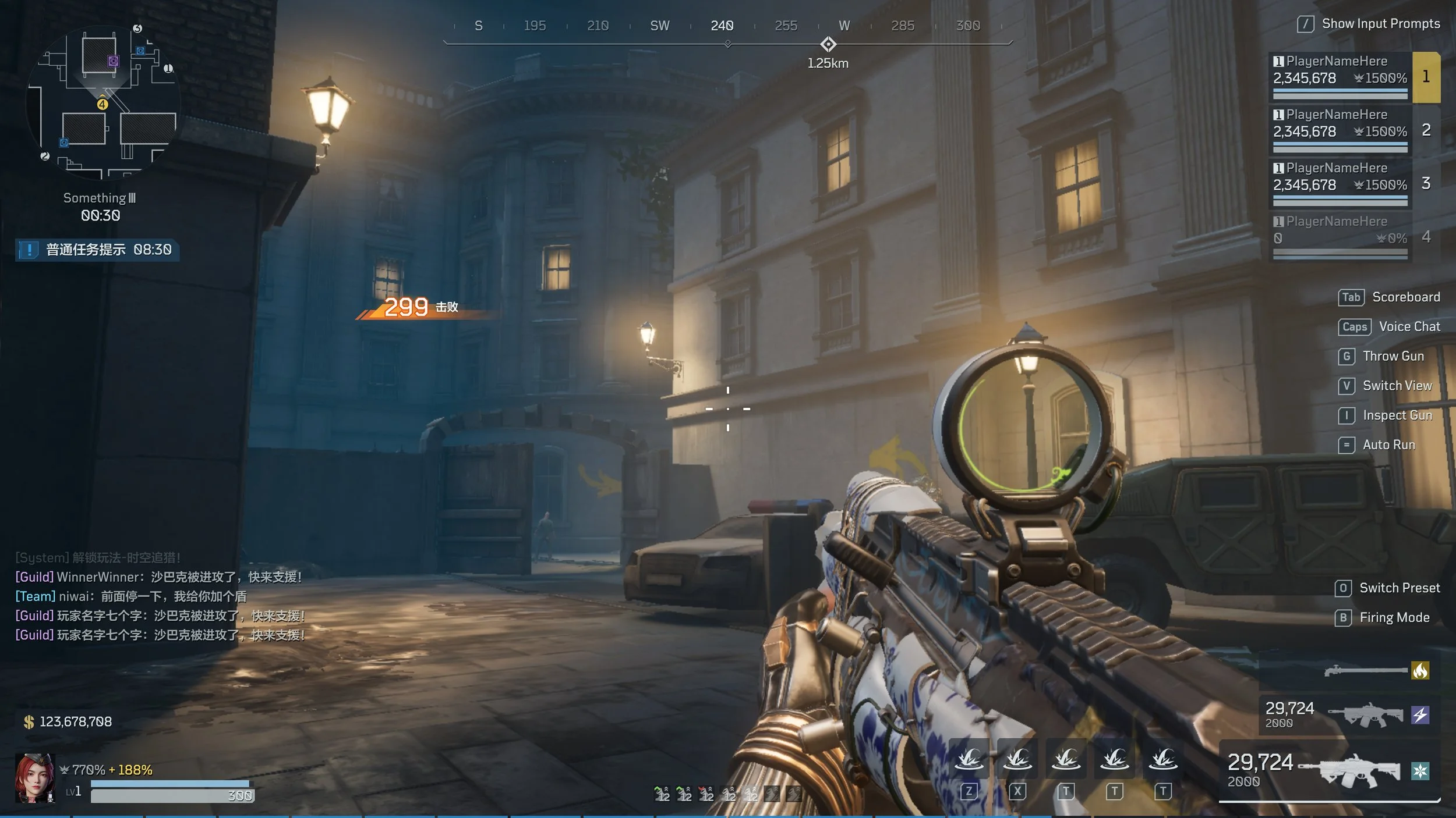
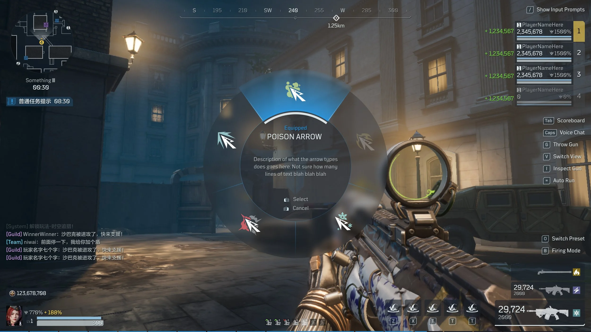
Delta Force: cross-platform development for both PC and mobile. My tasks included driving quality improvements by refining and polishing the UI, and localizing the interface to ensure it resonated with a global player base.
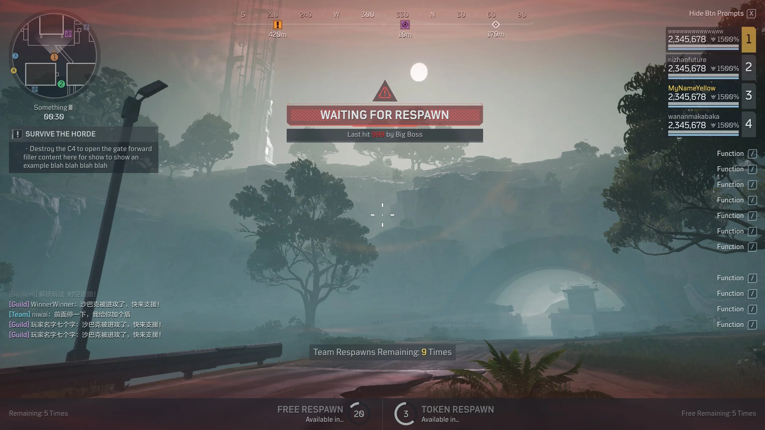
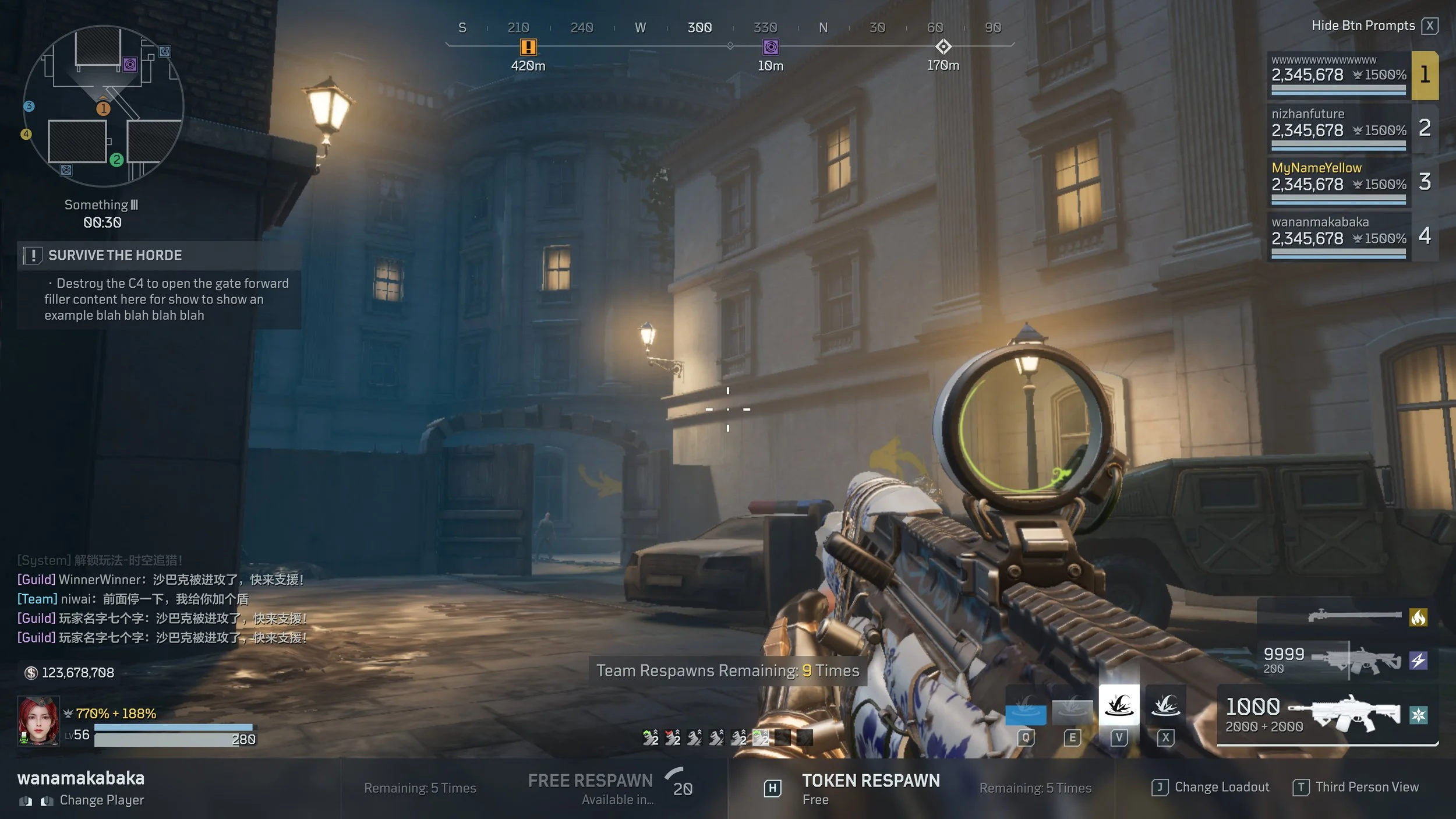
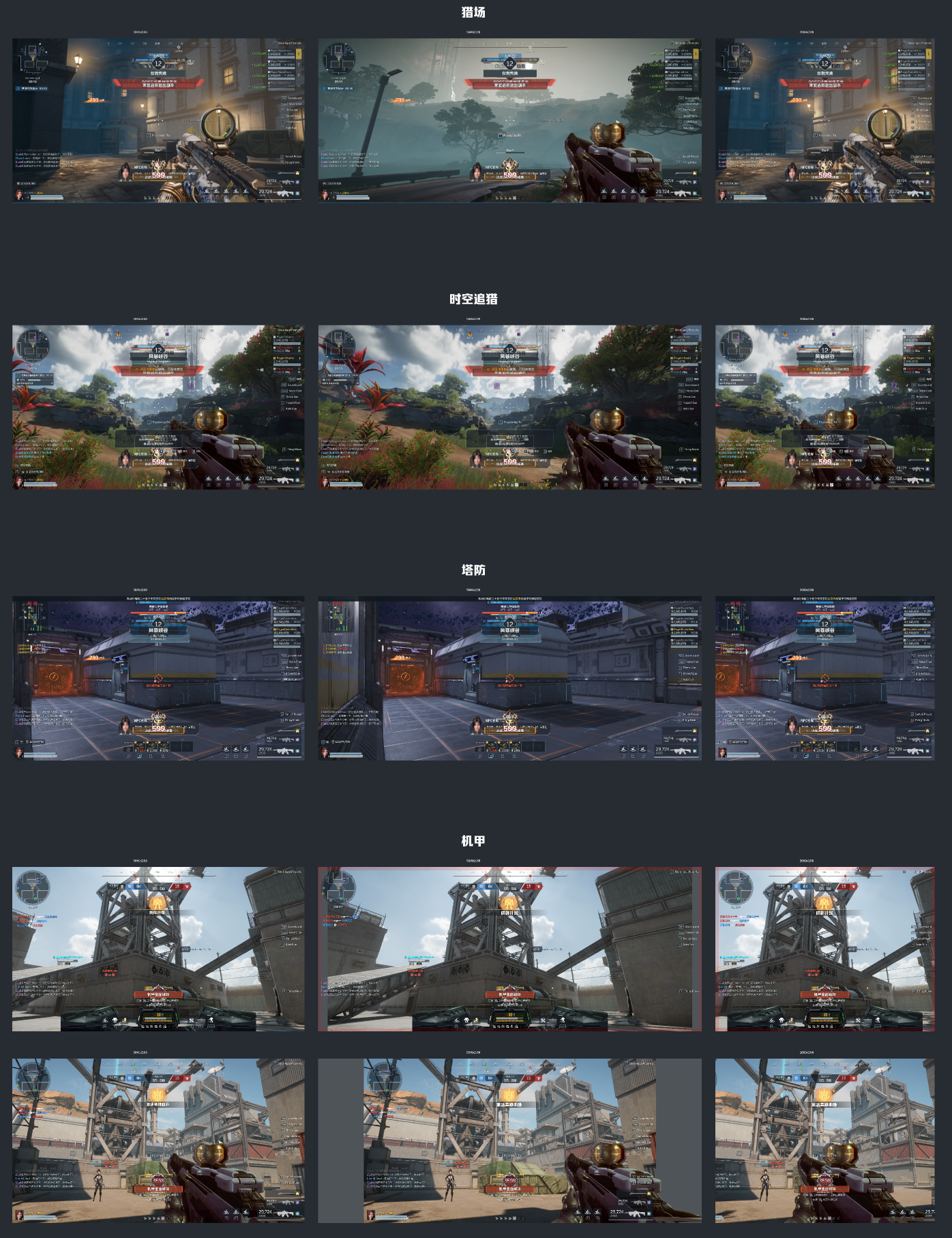
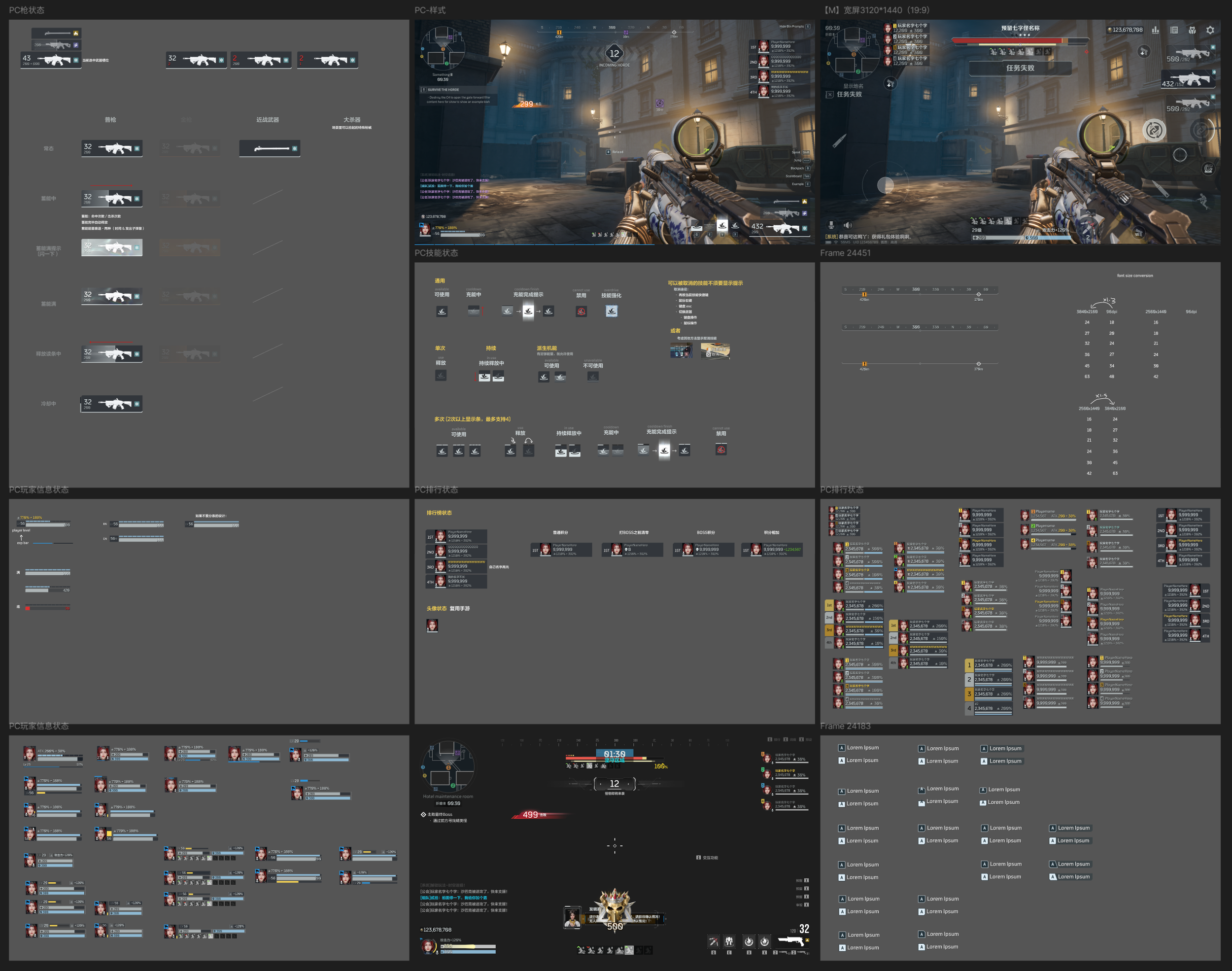
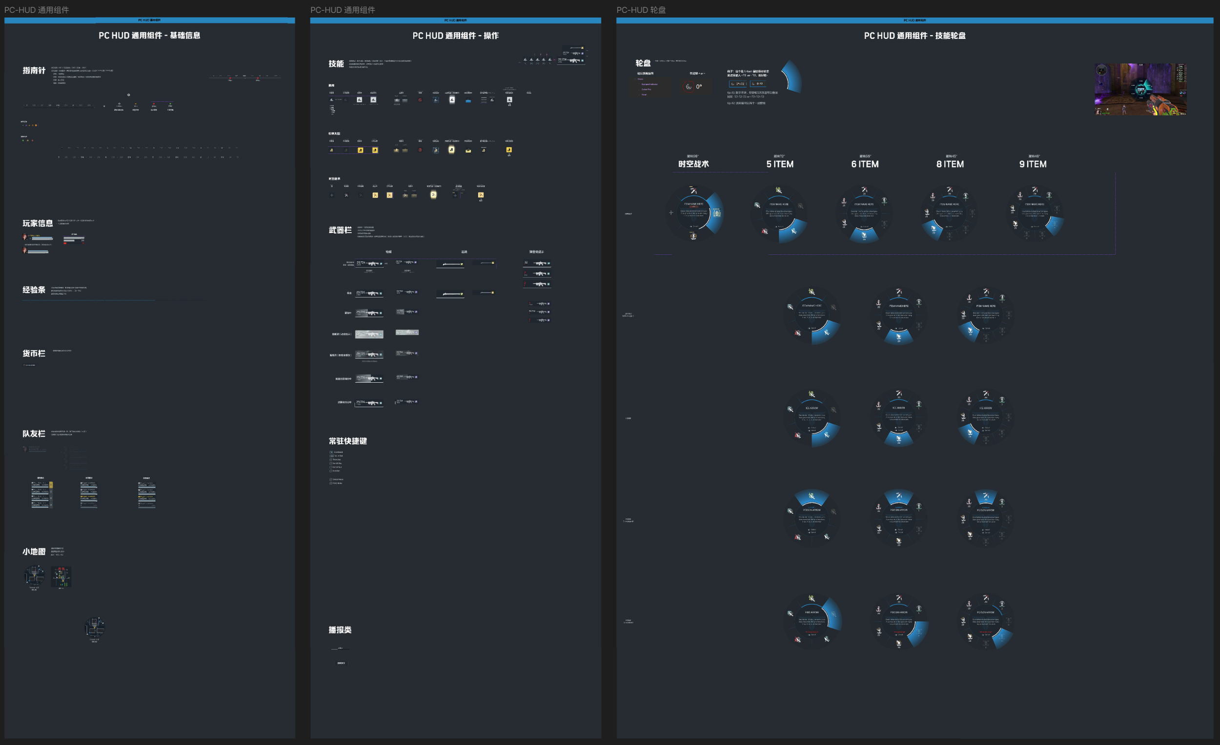
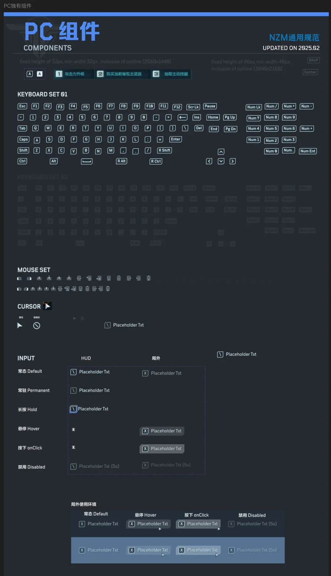
Leveraging my experience from Delta Force, I led the end-to-end UI production for Nizhan Future’s PC platform starting from inception. I defined production processes tailored specifically for PC, ensuring a scalable and future-proof foundation, including adaptive layout and scaling rules for various resolutions, structured Figma file management with reusable components.
In addition to setting up the design framework, I was directly responsible for the look and feel of the UI: defining the visual style and creating a cohesive aesthetic that pays tribute to the original PC version while aligning with the new mobile release. My work laid a strong foundation for ongoing development, cross-platform consistency, and seamless expansion.
// U I A R T I S T //
Ubisoft Singapore
As a UI Artist in Ubisoft Singapore, I work with a team of talented developers to conceptualise, create and implement the UI that best represent the various features of the game using in house tools - Anvil & Phoenix. We build all our features from scratch - from wireframes, to static and video mock ups, and in to the game.
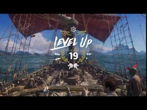
Did the VFX for level up
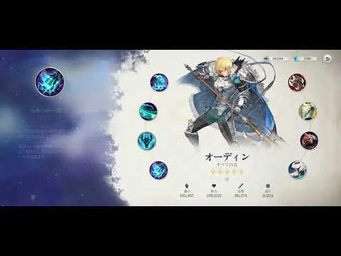
UI/UX practice done in my own time.
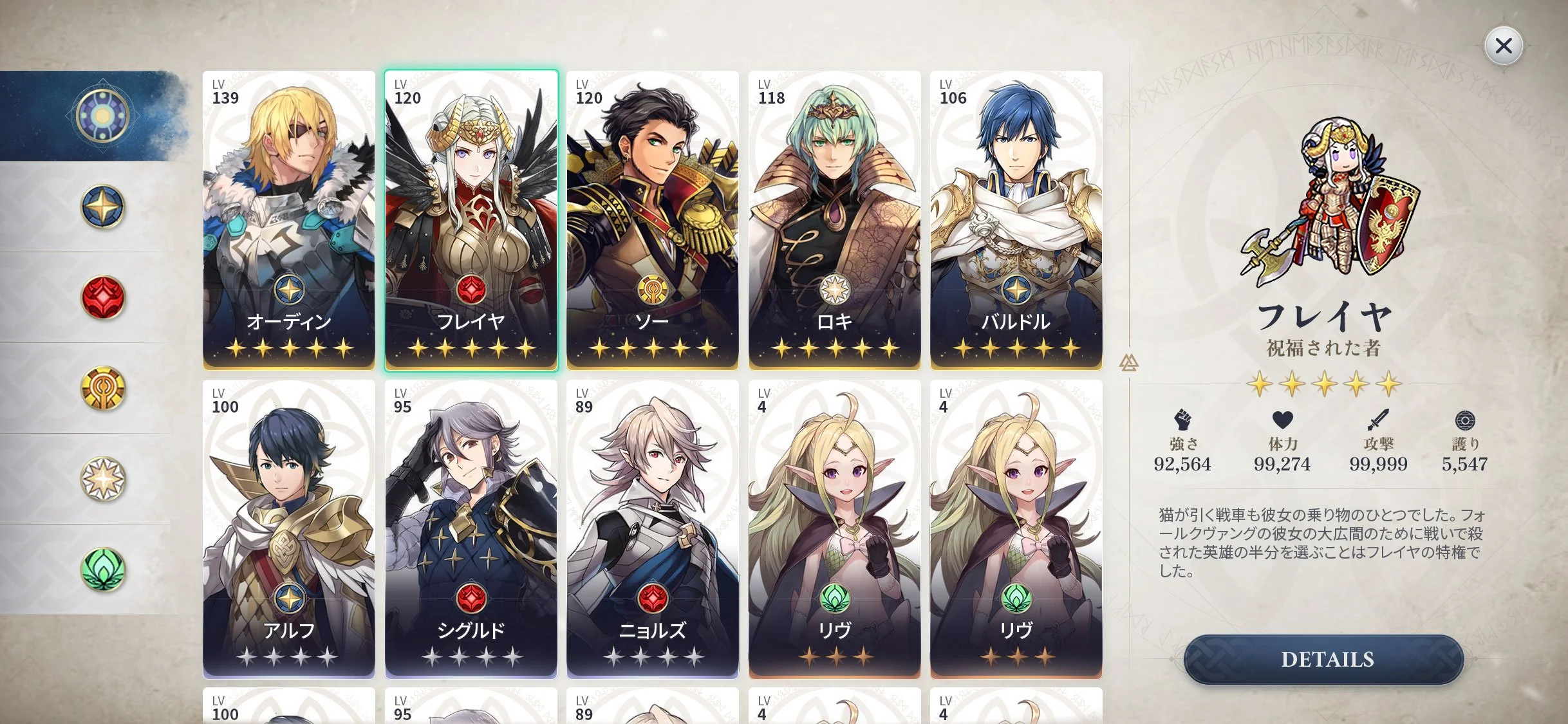
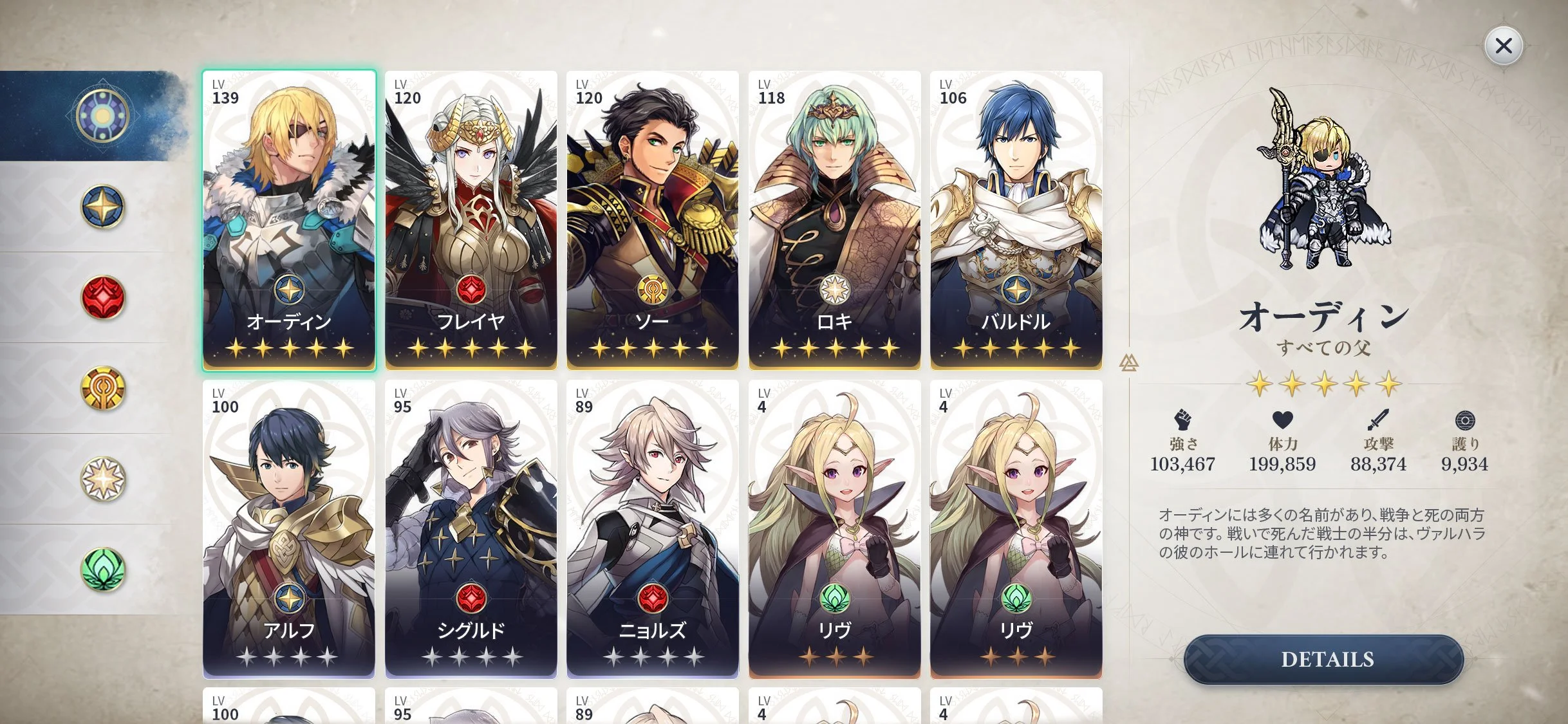
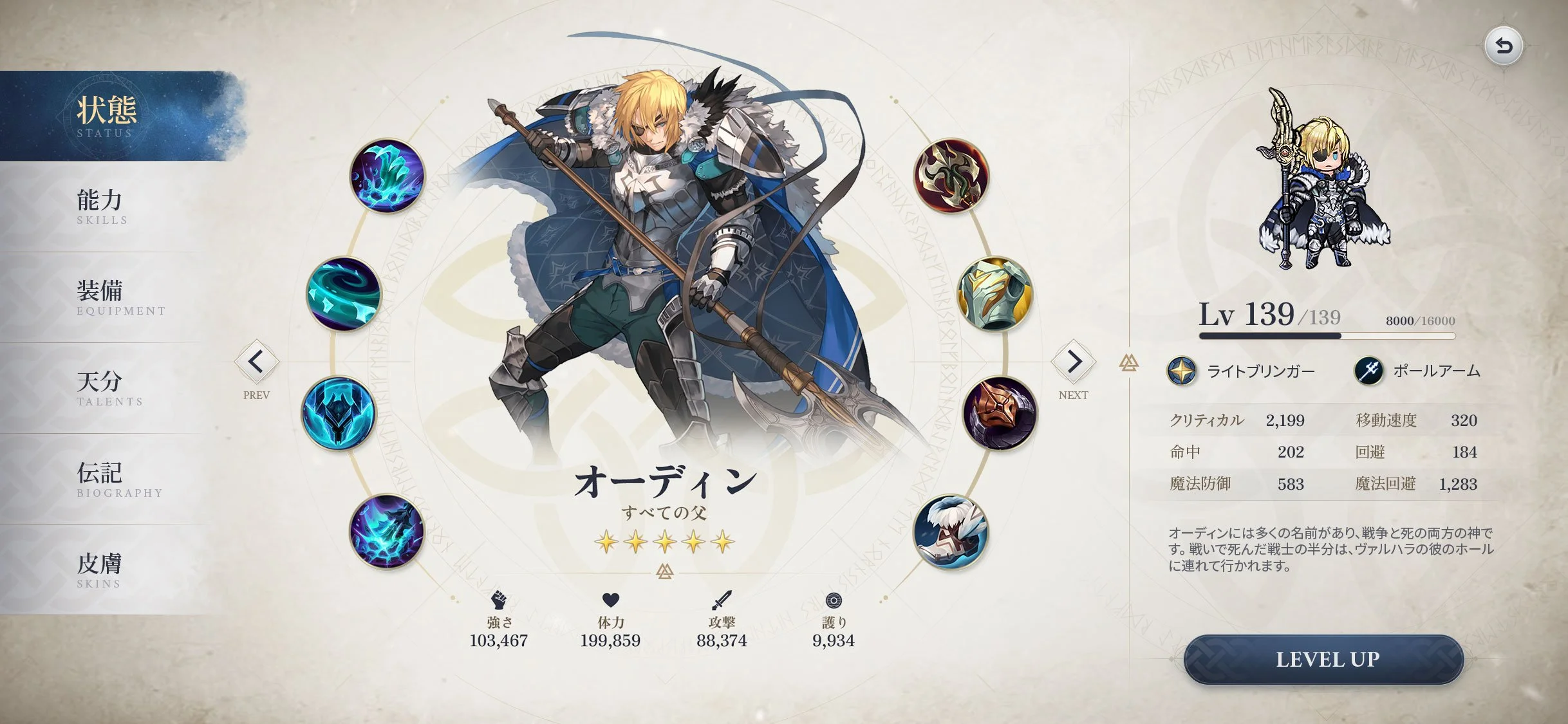
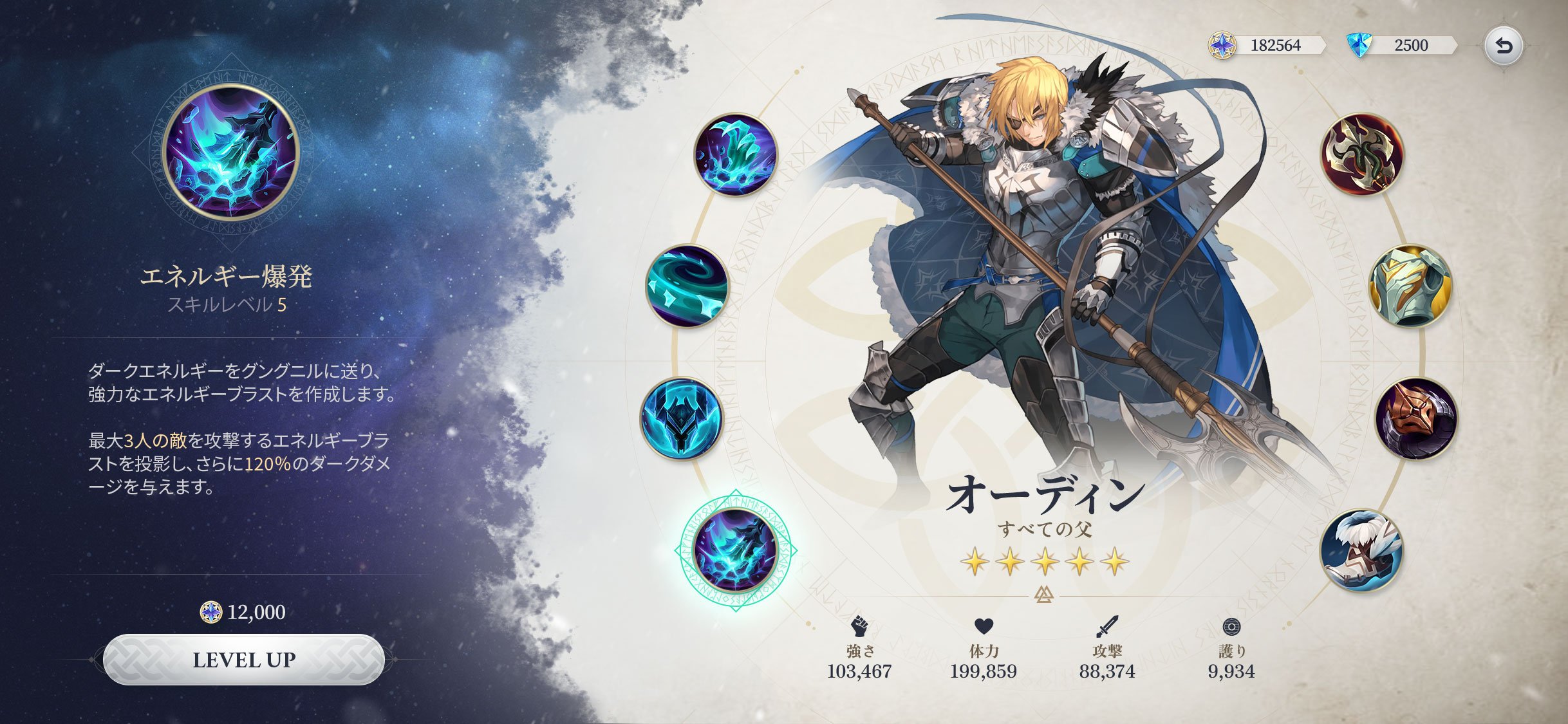
Mobile UI concept for a game on based Valhalla and Norse mythology.
Drawing inspiration from Norse mythology where the “hero” traverses through the nine realms and meets comrades along the way to help them save the world tree and prevent ragnarok.
UI/UX direction by me, but there many art assets that were borrowed from other games to assist in my practice.
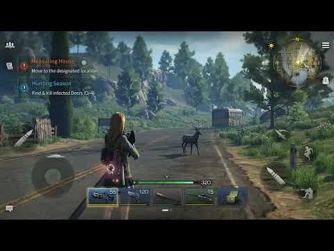
Task was to make a PC version of Lifeafter, and the mandate was to make it different from the mobile version. The game has been live since 2018 I had to ensure that there was style consistency in order to convey the message that it was still the same Lifeafter that players are familiar with.
(Left) Before (Right) After
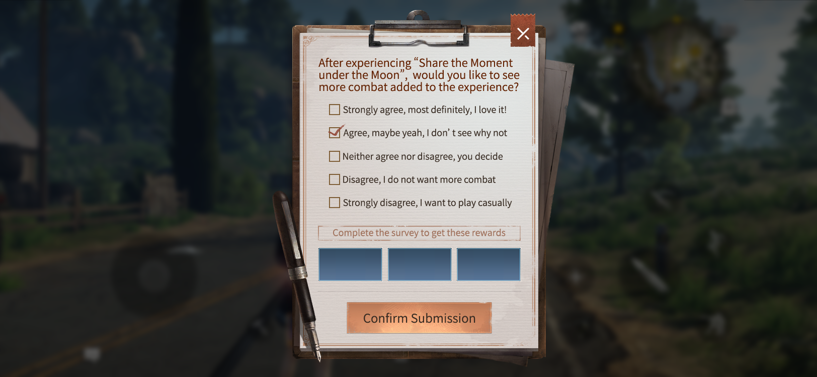
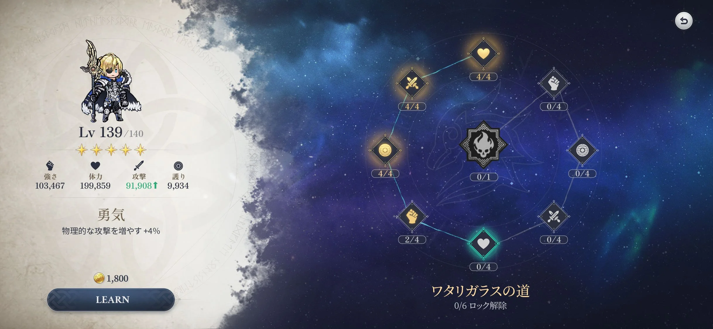
Re-designed the combat preparation phase, the project came to me with a long standing problem of being unable to communicate the system clearly to the players.
// S E N I O R U I A R T I S T //
Yoozoo Games Shanghai
My first mobile endeavor, on a very interesting IP. Everyday is a new learning experience with lots to discover, considering how different mobile and console development is.
My duties include creating UI mock ups, liaising with Game Designers and Programmers to make sure the UI is properly executed from start to finish. Also going straight into Unity to polish the UI.
// WORK IN PROGRESS //
Three Kingdoms concept on mobile
Credits to:
Elson Soh Wei for the UX wireframes
Bemore Design for the WEI character
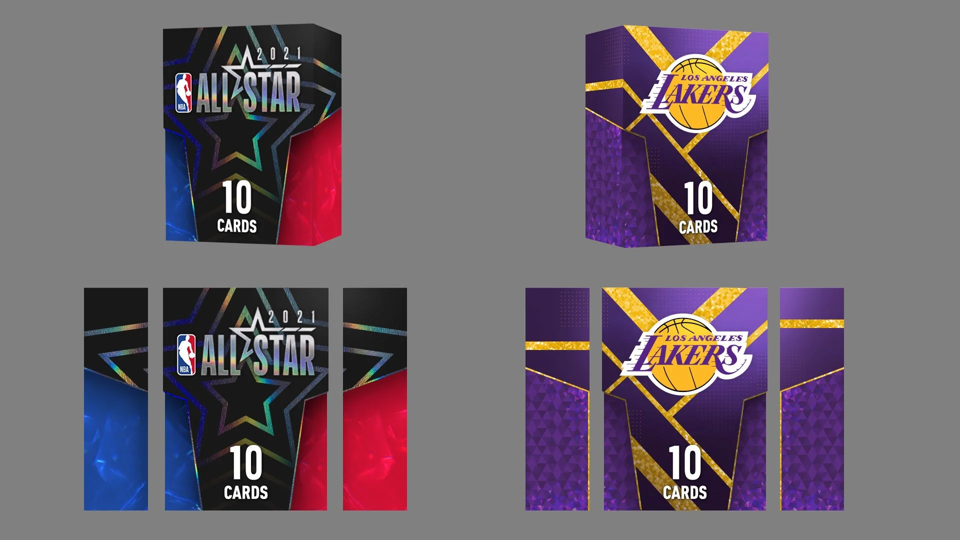
Created an NBA concept with a team of various professions (full credits at the end of the video)
The video is fully recorded footage from a build we made in the game engine itself. We didn’t want to create a proposal that just looked good only in a video, we actually proof tested this entire concept in engine.
I had the opportunity to participate in a project’s design concept proposal, we were competing with other art and design departments to win the designing rights for an NBA card game. We won the bid, but shortly after the project was cancelled.
My part was to oversee the cards and packaging design, from creating the design concepts, cooperating with modelling and special effects to make it shiny in the engine.
This project also gave me the opportunity to lead my team of juniors in NetEase to contribute lots of card ideas and provide good practice for them to gain a feel of what it’s like to work on a fast paced project.
With a team of people, we created a fictional concept for a Hataraku Saibou game
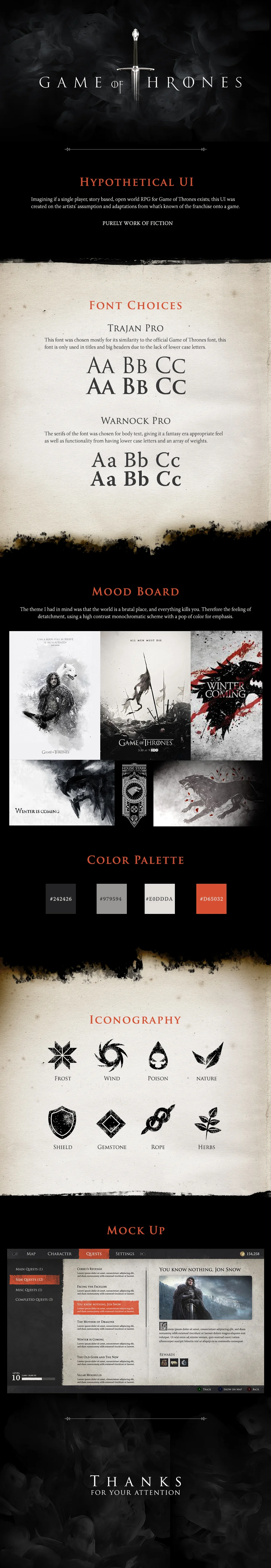
This was a mock style guide for an imaginary Game of Thrones game. Inspired by how stories of knighthood are passed down in the using ink and paper, this was how I imagined a single player RPG to record the legacy of the player.
Colors were chosen based on the elements that exist in the story, such as fire (orange), smoke (grey) and burnt things (black)
Texture in the UI also plays an important part in terms of helping the player immerse into the universe of a dark, uncaring world; where things are broken but they still work.


![[G66]游乐园家具_Quinn.png](https://images.squarespace-cdn.com/content/v1/5c9b7e49f8135a30a8caf9a0/1680002406125-P3HWH1JNXX74UOA7UNZT/%5BG66%5D%E6%B8%B8%E4%B9%90%E5%9B%AD%E5%AE%B6%E5%85%B7_Quinn.png)