Dead In Vinland

Keeping a shipwrecked Viking family alive on a mysterious island one day at a time.


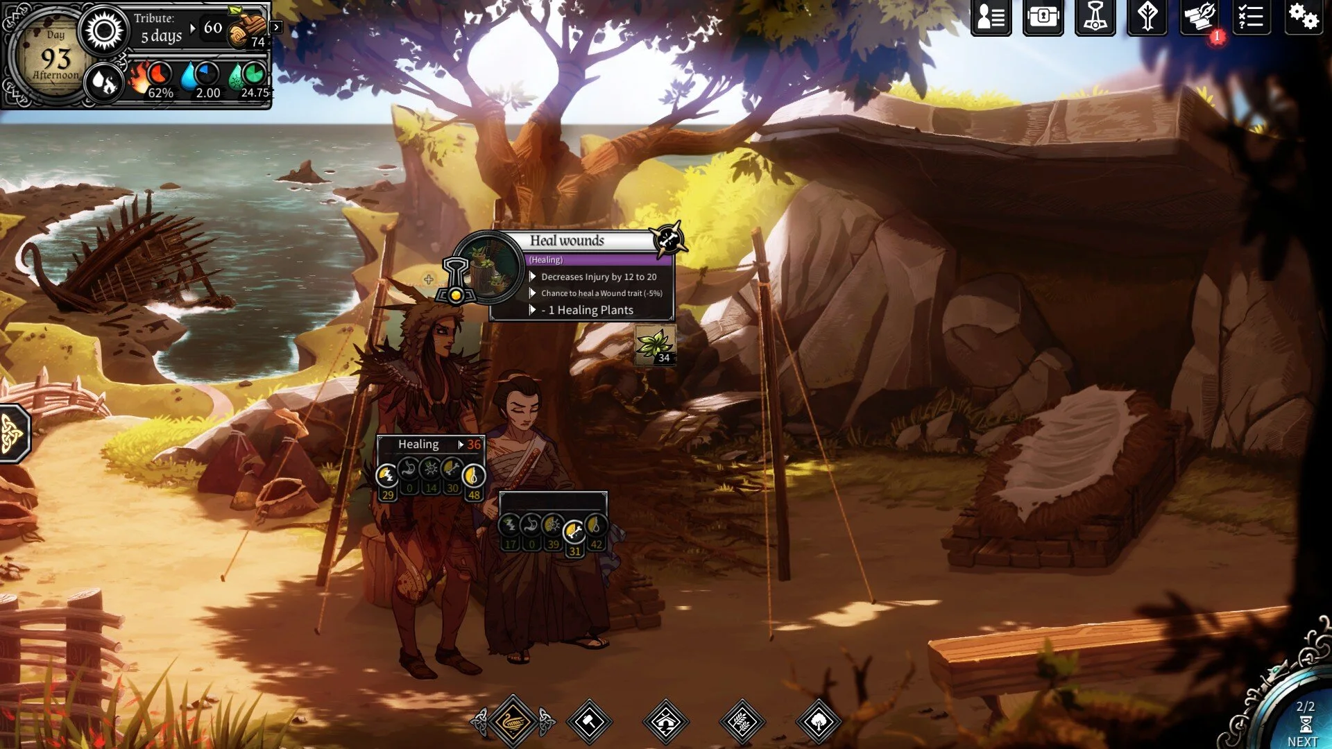
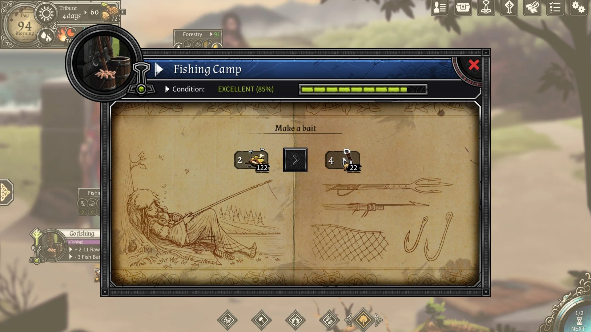
Players help the exiled and shipwrecked family to establish their base, collect / manage resources, explore the island and stay alive. Every now and then, there will be battle and it is turn based. Gameplay wise, controls are pretty simple, mostly clicking, dragging and dropping. The stats and traits of each character give this game depth by affecting their efficiency in camp, and in battle; akin to tabletop RPGs and dice rolls but the results are calculated for you.

The art drawn style does a good job of drawing people in, although all animations are mostly very simple. The layout definitely does a good job at presenting plenty of information to the player in a digestable, easy to understand format, and doesn’t feel overwhelming.


Developer: CCCP | Publishers: Dear Villagers, Plug In Digital, MP Digital LLC | Engine: Unity

A Way Out

Following the adventures of 2 people finding A Way Out


Completed the game 3 times with 3 different people now, game has limited replayability from varying story choices; all leading to the same ending.

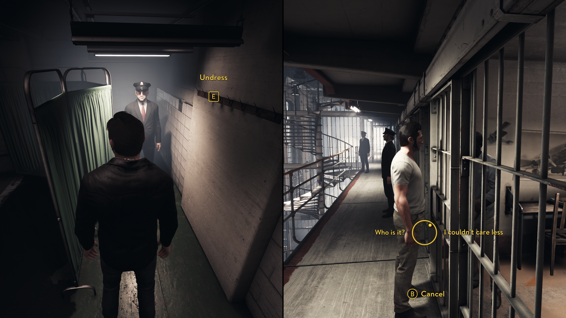
The game itself plays more like an interactive movie rather than a game, although it does have some gameplay resulting in the player being more invested, and excited when events happen. What makes this piece interesting is the split screen, co-dependent co-op experience, and cannot be played without another player. Both players must work together in order to get through obstacles, communication is essential.

UI is simple, bare minimal, and only appears when it is needed; works well for a linear story movie-like game. The UI consists of simple shapes, and only 1 main color, which is yellow. Although yellow itself is a bright color, the environment is nicely set up to not conflict with the UI, the UI is still nicely shows up on screen.


Developer: Hazelight | Publisher: EA | Engine: UE 4

Genshin Impact

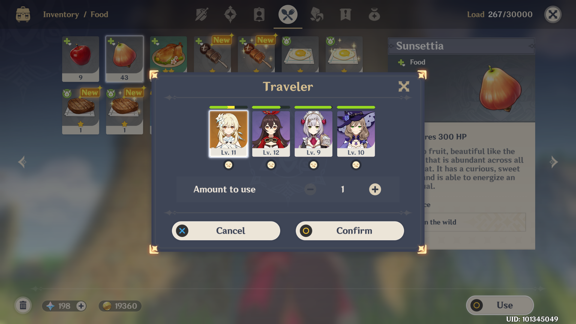
Impressions from the first few hours of Genshin Impact (China Server).


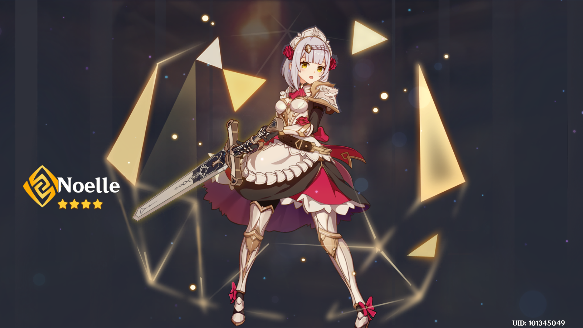
Before the game was released, many folks were comparing this game to Zelda, BOTW (and gathering a lot of hate). Personally speaking, after playing just a little bit of both, the thing that is most similar would be the art style, but that’s about it. A lot of mechanics are much, much simpler in Genshin (cooking doesn’t require experimenting, your equipment doesn’t break, dungeons are straightfoward just to name a few). The most obvious difference would be the characters (since Genshin relies on gacha to survive), each character has their own specialty element and weapon; with a total of 7 unique elements.

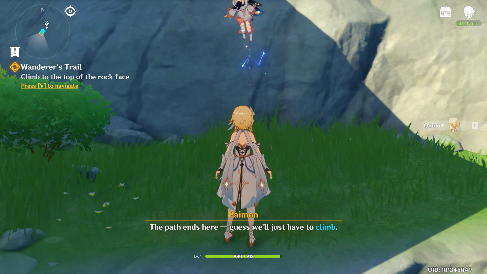
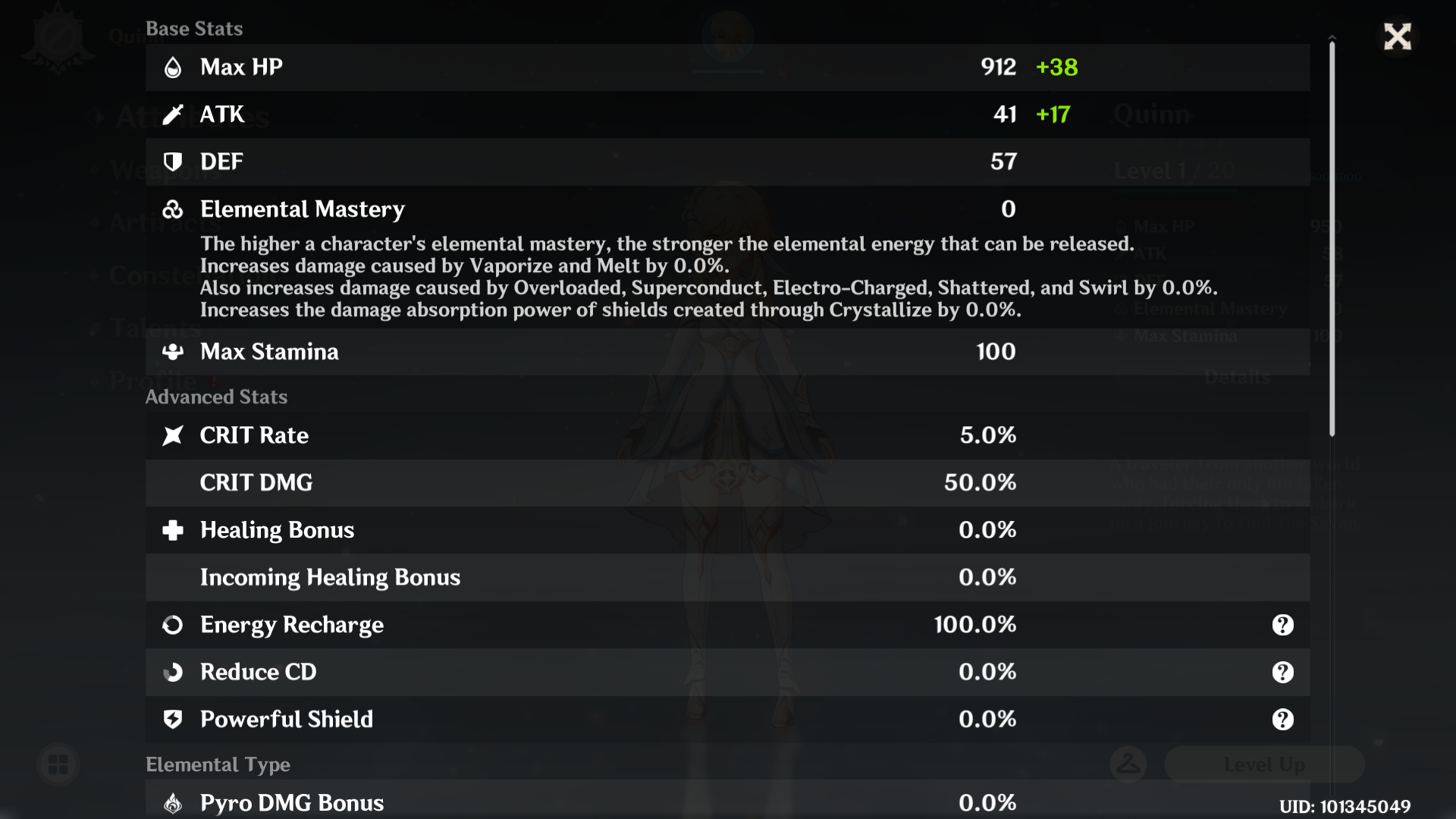
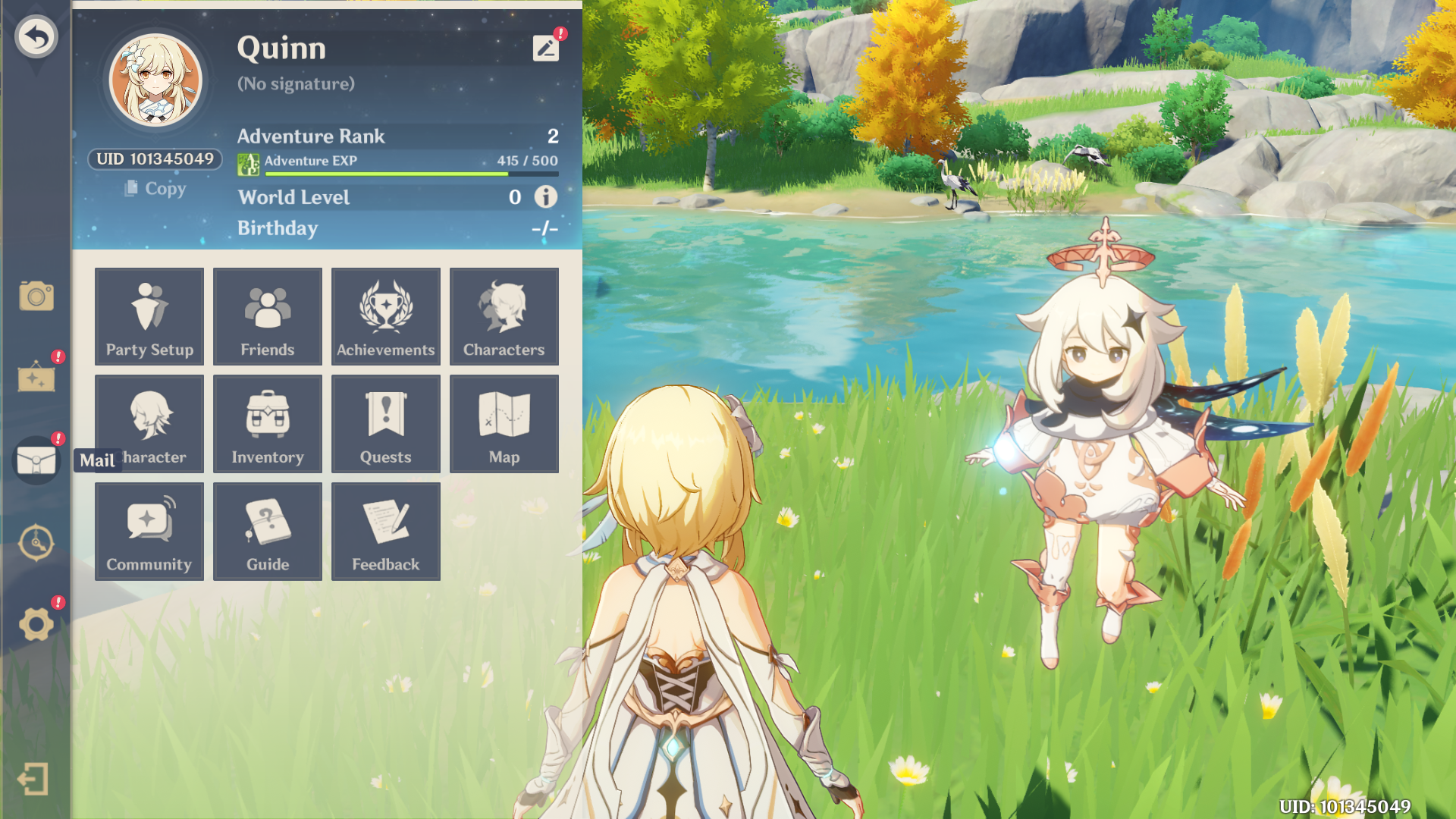
When I first went into the game, my initially thought was that the UI is clearly oversized for a big screen, but all for good reason knowing that it easily ports to mobile devices. I tried it out by sending these screenshots to my phone and it looks perfectly normal on the screen of the phone.

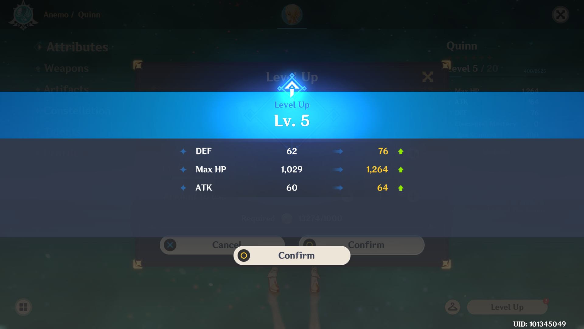
Overall, the UI is leaning towards simple, but what makes it aesthetically pleasing would be the effects applied in the game. For example, screens like the Character Properties screen would look dull as a screenshot, but with the constantly shifting particles in game, make it look like a very nice starry background. The transitions in-between are quick yet detailed, adding even more polish to the game. The characters are also aptly animated with idle animations and random movements, never a static moment in the game.

Whatever I write is only applicable to how much I’ve experienced so far, probably might change as I play more :)


Developer: miHoYo | Publisher: miHoYo | Engine: Unity